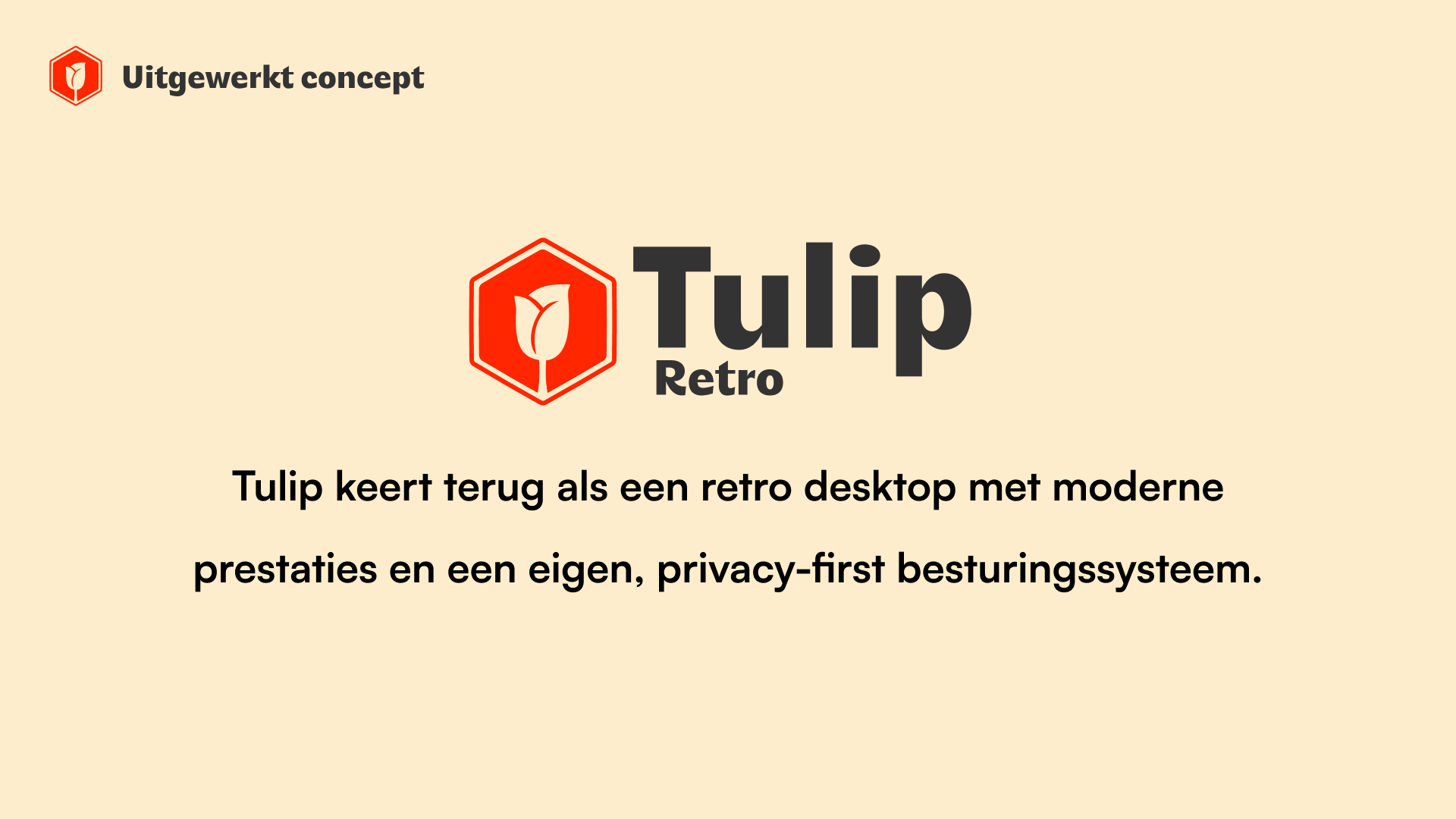
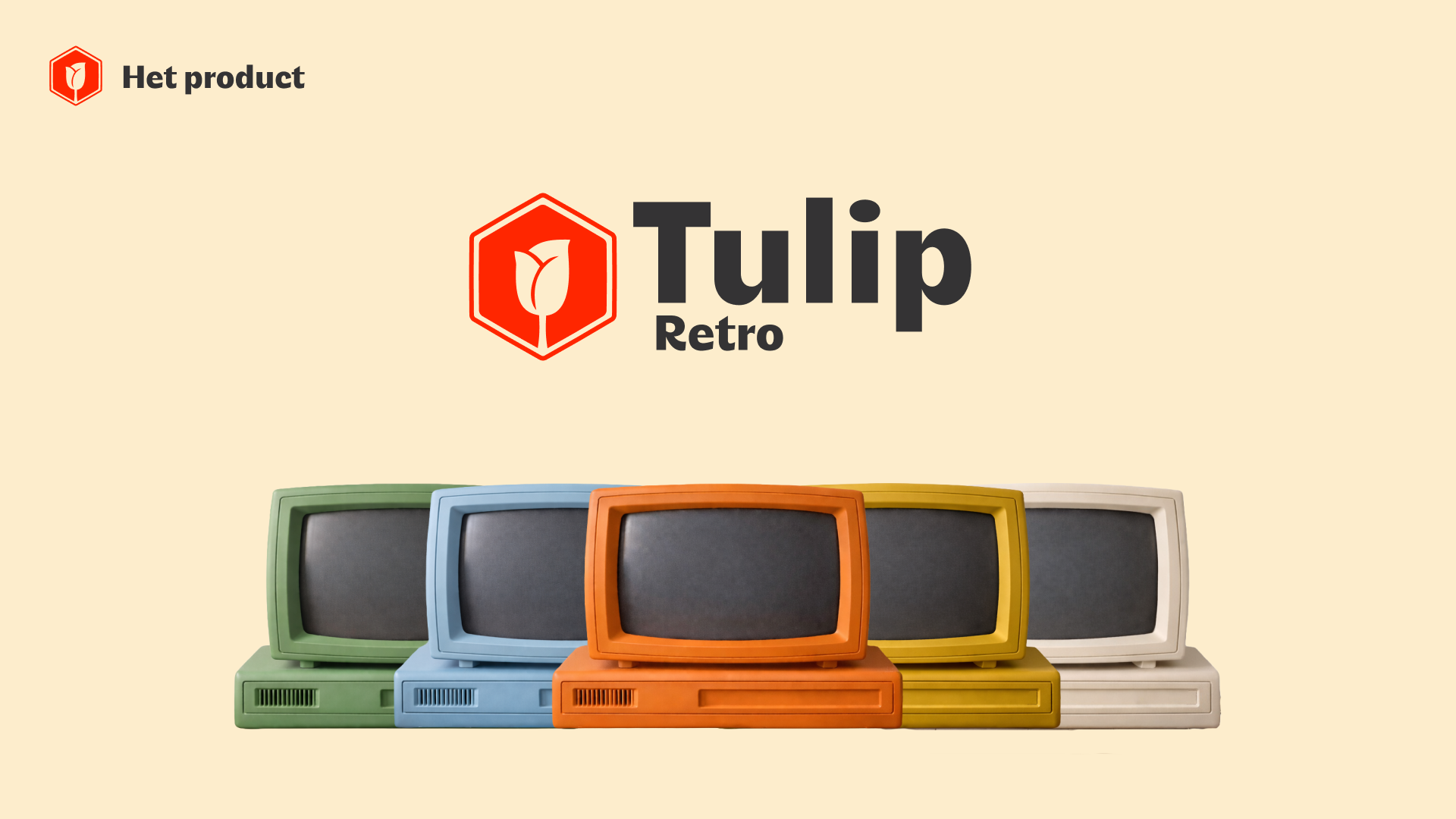
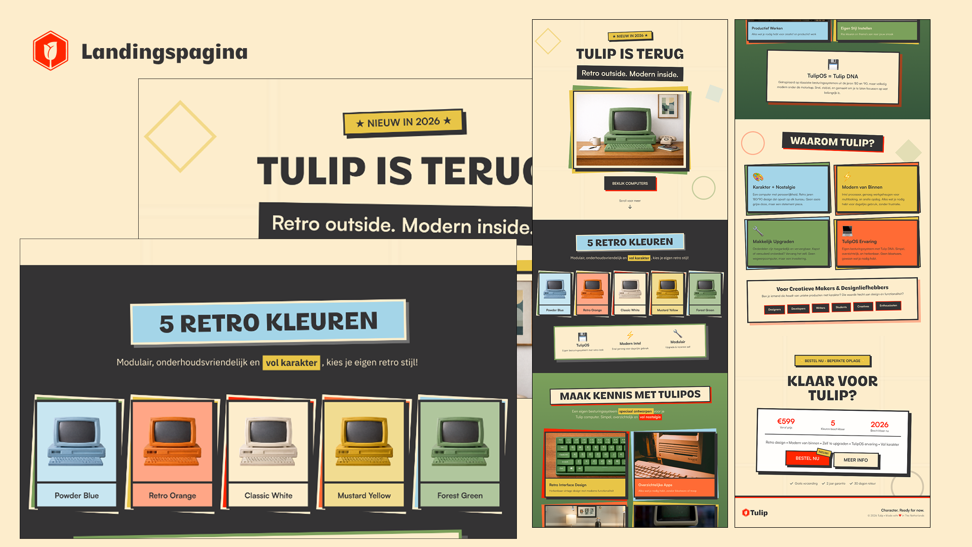
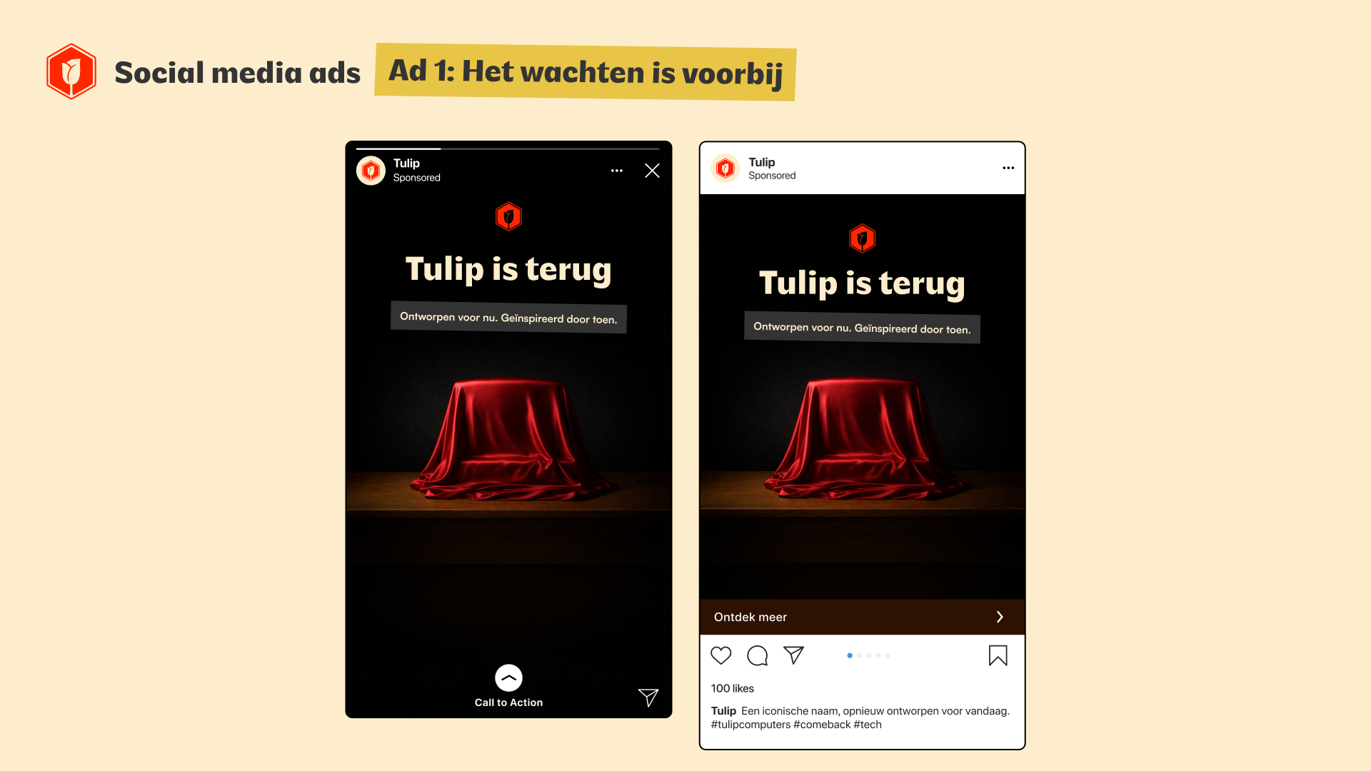
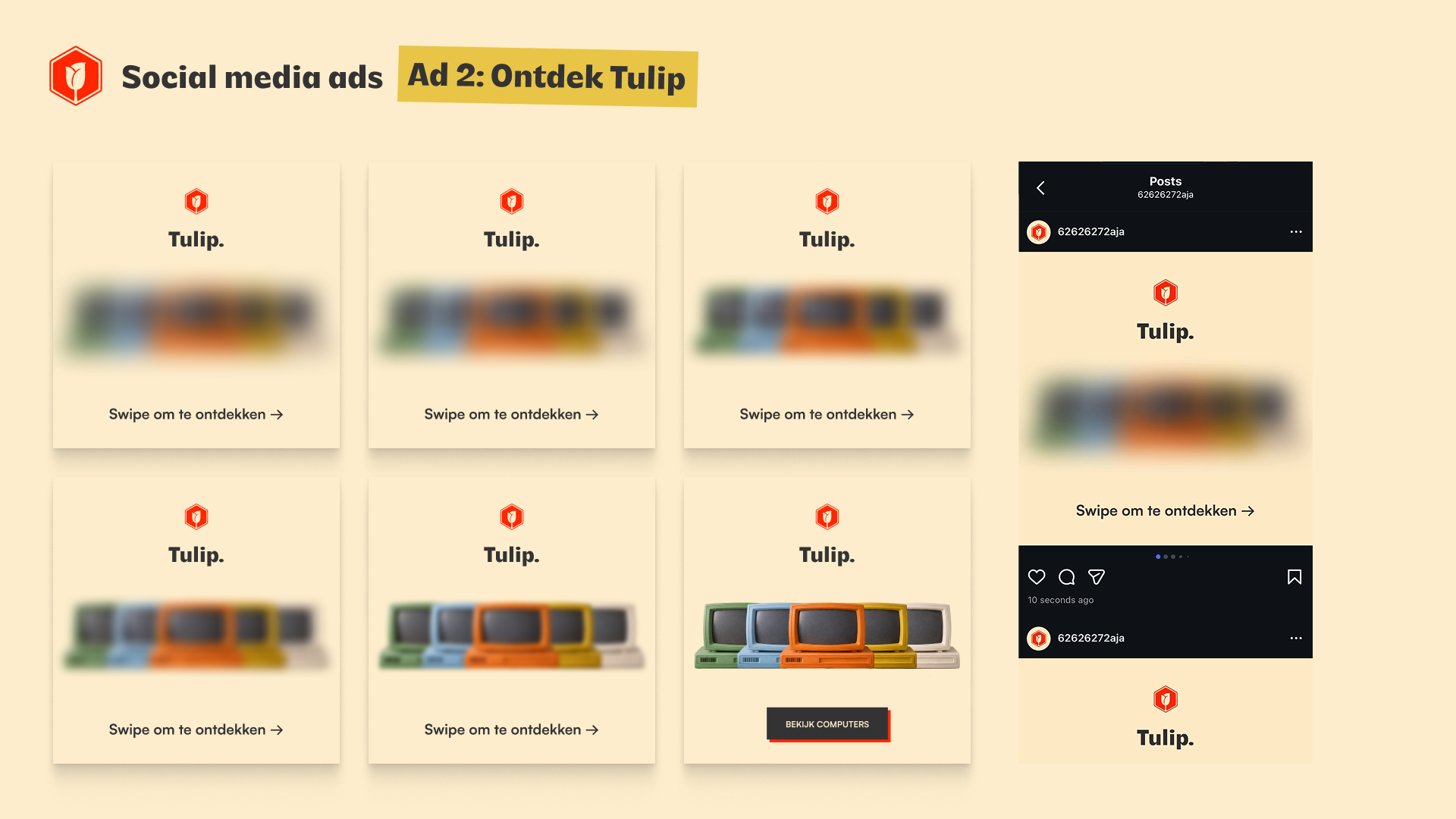
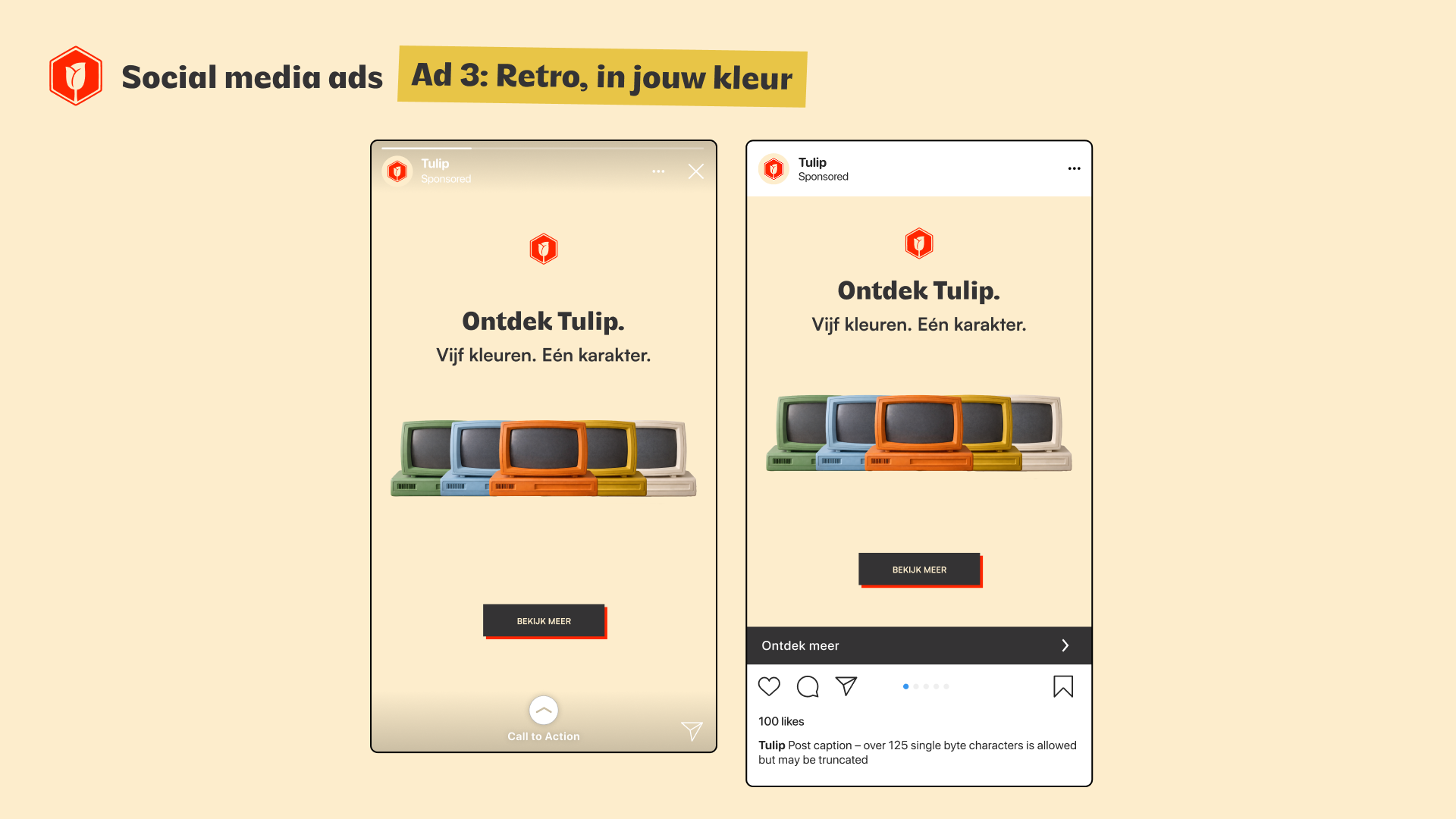
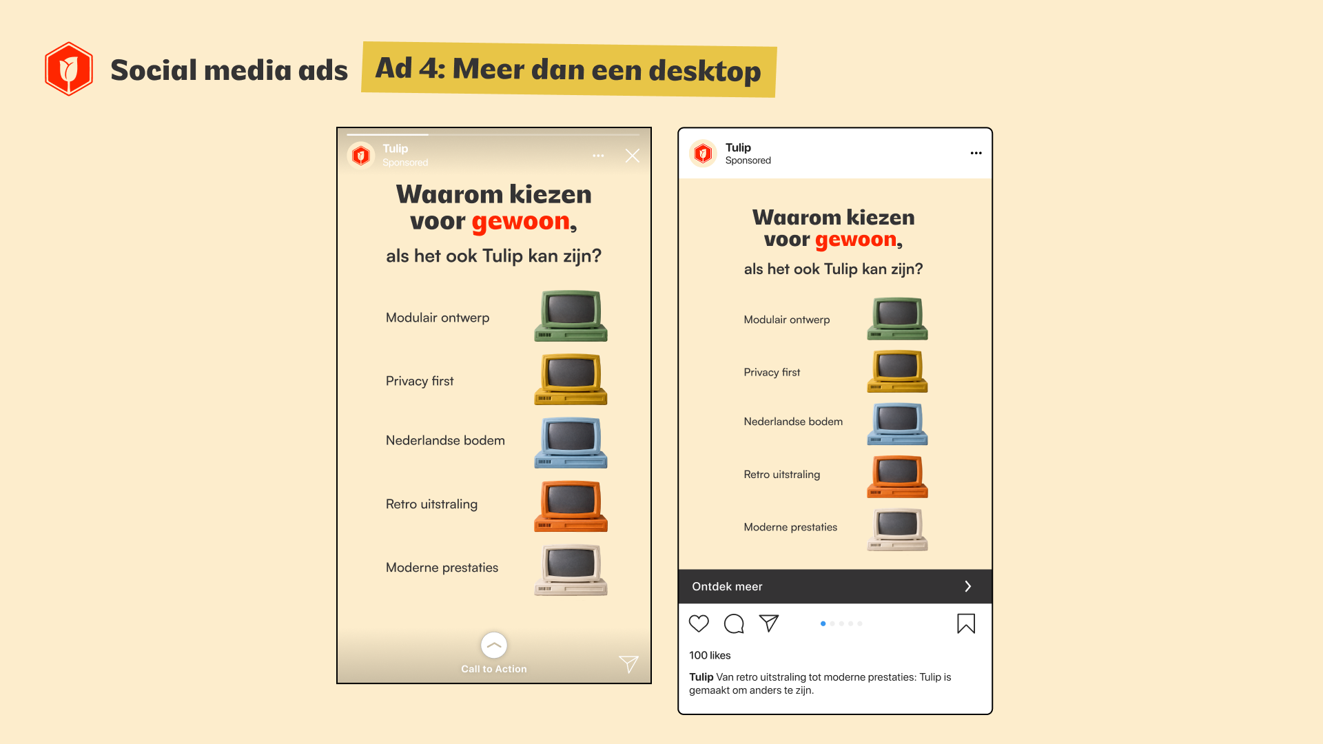
The goal of this project was to bring Tulip back in a way that feels relevant today, while still respecting its recognizable identity. The focus was on creating a visual system that feels simple, confident, and easy to understand.
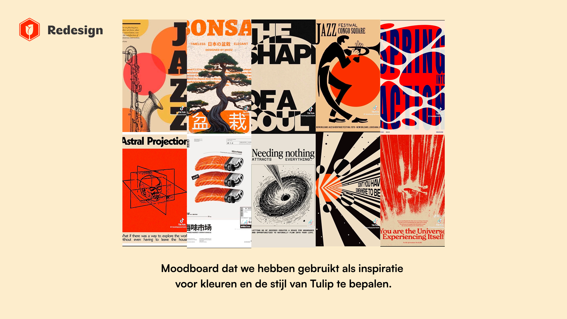
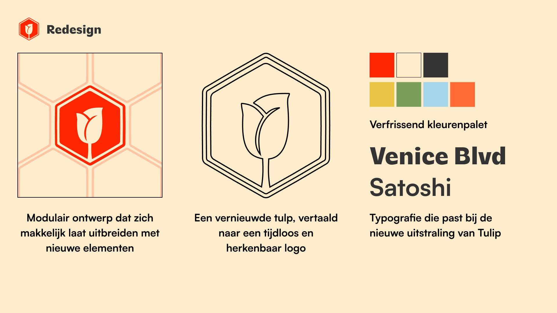
I explored how color, typography, and layout could reshape the brand into something more modern and accessible. By reducing visual noise and focusing on structure, the design becomes clearer and more consistent across different touchpoints.
The result is a refreshed brand direction that feels both familiar and new. It creates a strong foundation for communication, while keeping the brand recognizable and easy to connect with.